In the studio I decided to consult with Josh about how to loosen up my style and what was the best approach to take when creating the concepts. He suggested I spoke with Aaron Foster, a tutor at Uclan who also has his own Indie Development company LunarSoftware.
Here is a link to the website: http://www.lunar-software.com/2011/11/
Aaron is a great artist with a lot of industry experience. He showed me a really good brush setup in photoshop. With this setup I was able to create some really nice, loose concepts.
WPGs Pete showed me an email he received from Cornish artist Steve Hiddleston, in the email Steve beautifully explains the colours of the Cornish countryside:
"I have been checking out your visuals on you website and the look really
great - but as an old school colourist I feel obliged to warn you that too much
dark green is known to be depressing - think rusty orange bracken -
think buff seed heads - red berries - yellow flowers - blue hills etc"
I love how he described the colours! I will continue to consult with Steve throughout development of Ether as his knowledge will be extremely helpful.
I also looked at his youtube channel and found some really bizarre videos:
http://www.youtube.com/user/mr5tevie?feature=watch
on his website I found a video called dangerness. From this video I took a screen shot and created a colour swatch that I used to create the concept bellow.
This Concept Took around 30 minutes to create, I wanted to work fast to see what I could produce and I am pretty happy with the outcome.
9th-11th FEB
Texturing
With the techniques acquired through working on the concepts I created some environment textures.
Maya
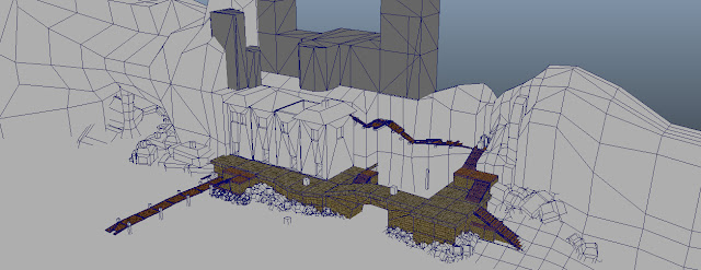
I developed this environment based on the early concepts of the harbour I created. The cliffs and rocks are placeholders to give an Idea of how the cliff side could look. From here I exported the scene and imported it into UDK.
12th-13th FEB
UDK
I started by adding the cliff face in and then placed the harbour floor, this was the first time I saw the textures in UDK and on a whole i was happy with how they looked in engine.
I then proceeded to build the scene, adding in the buildings, beach front, stairs and rocks. At this point I decided to test the scale of the environment in relation the the player and found that some aspects worked well and others did not. The stairs and pathways worked fine, but the door frames where too big and the textures applied to the floor were large which made the player feel a lot smaller then I had intended.
The image above demonstrates the scale of the Island.
With out giving too much away in terms of game play I had to create a player path from the rock at the bottom left to the buildings at the top of the cliff.
At this stage in development I was still unsure of the visual style, but Pete and Ben where happy with the progress I had made and liked the direction I was going.


Goog stuff, OJ. Found the Ether project on indiedb, and it's looking really slick. Keep it up.
ReplyDeleteWeb design services near me
ReplyDeleteHands of Ether web development provide low-cost web development services online, Check our web developer portfolio and get the best web design services near me.
to get more - https://www.handsofether.com/